deri-ui · elements
Building blocks, structured
Buttons, forms, feedback, media, and data primitives — each section is a focused playground with copyable usage.
actions
Actions & labels
Primary controls, attached groups, badges, and icon buttons.
Buttons & badges
Variants
Composition
feedback
Feedback & status
Alerts, avatars, progress, and lightweight metrics.
Alerts, avatars, progress
Saved
appearance for soft, solid, outline, or left accent.Status row
forms
Forms
Text fields, choices, and value controls — each group in its own layout so nothing stacks awkwardly.
Form controls
Text fields
Shown on your profile
We'll never share your email
Username
Choices
Agreements
Plan
Switches
Value controls
TouchSpin
Rating
4 / 5
Slider
Clipboard
npm install deri-uioverlays
Menus, drawer, and panels
Dropdowns and steppers, plus drawer positions/transitions and panel chrome variants.
Dropdown, tags, stepper, theme
Quick actions
Stepper
- ✓Account
- 2Profile
- 3Done
DUDrawer + DUPanel
Drawer playground
Side, motion, chrome — mobile uses bottom sheet
Side
Transition
Variant
Elevated
Collapsible
carousel
Carousel styles
Switch variants with one sample set — hero, cover, cards, peek, gallery, minimal.
DUCarousel

Coastal Escape
Soft sand · Clear water

Alpine Ridge
High trails · Thin air
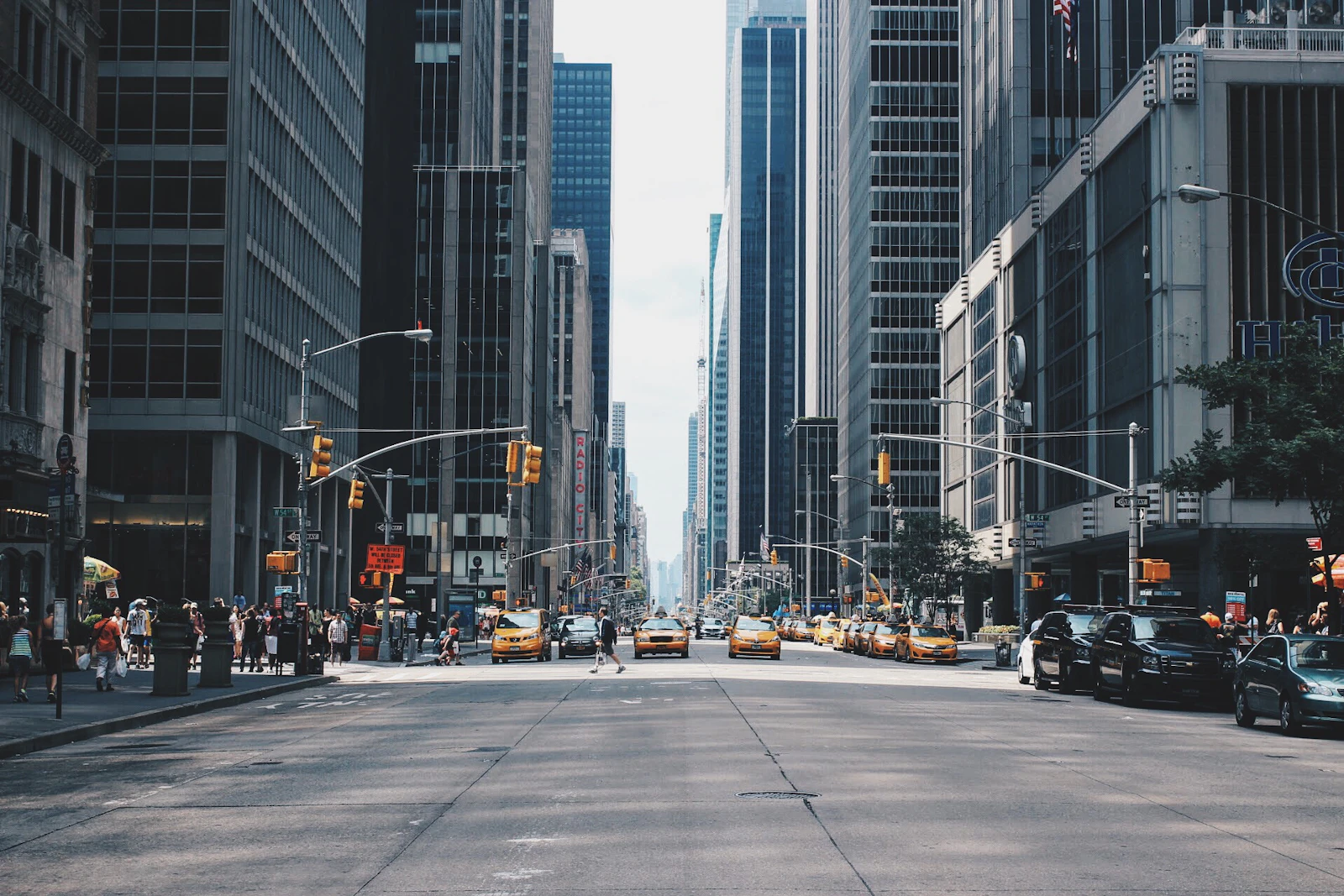
City Pulse
Neon · Night walks

Forest Path
Quiet · Green canopy
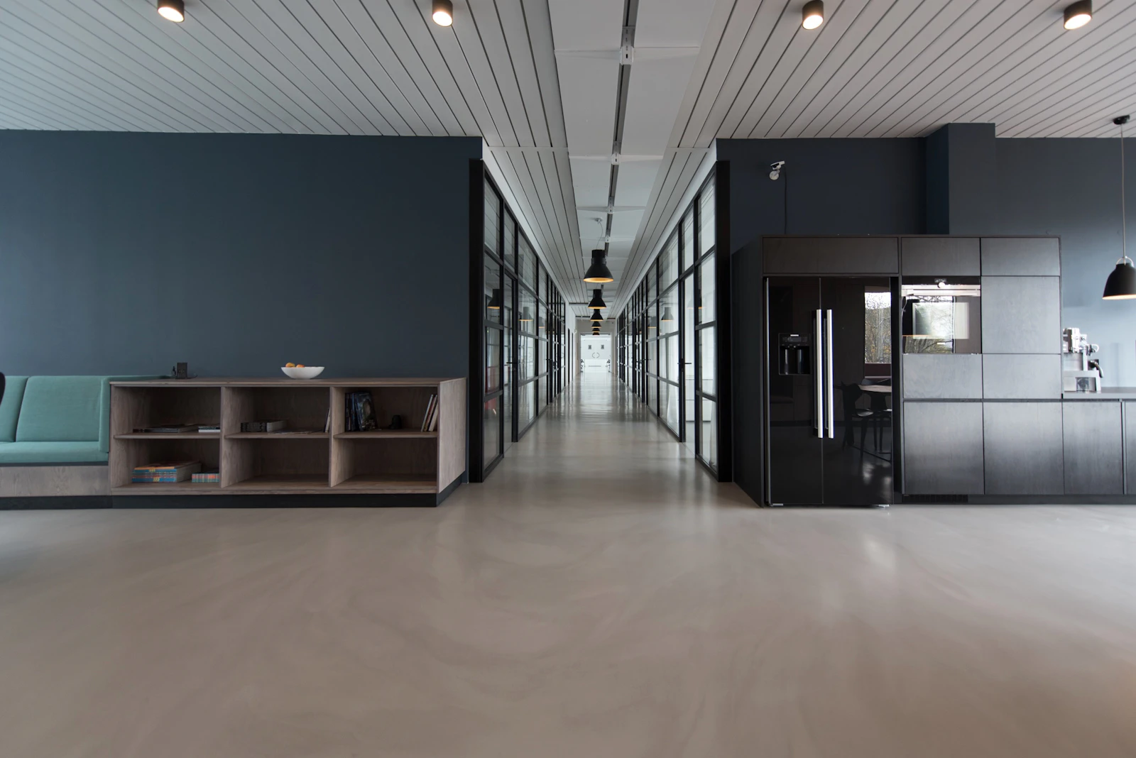
Studio Light
Workspaces · Calm focus
data
Data & files
Tree navigation, tables, pagination, and uploads in one workspace layout.
Tree, table, pagination, file
Project tree
Invoices
| Name | Status |
|---|---|
| Invoice #1 | Paid |
| Invoice #2 | Pending |
| Invoice #3 | Draft |
Upload
tokens
Typography & color tokens
Semantic palette from the Deri Tailwind preset.
Typography & colors
Design tokens
Semantic colors and type scale for consistent product UI.
Type
Heading four
Body text for descriptions and supporting copy.
Small muted helper text.
Palette
© 2026 Deri Ui. Developed by Deribew Shimelis. Copy and use the code freely in your projects.